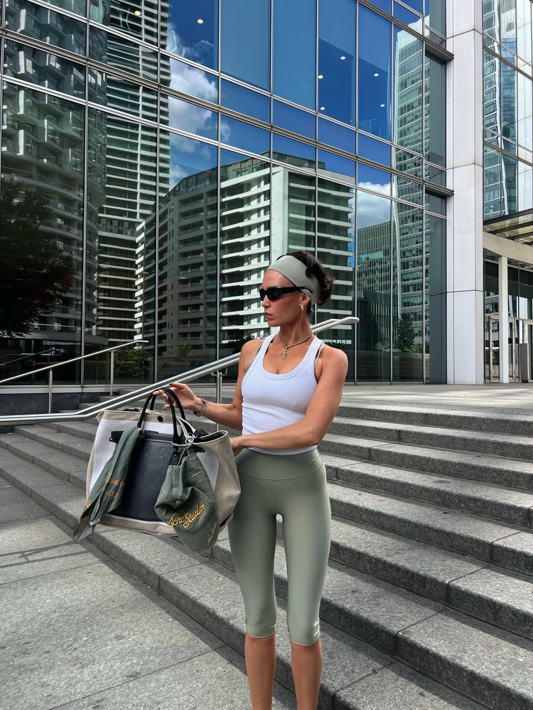
The city is not a backdrop in summer; it is the main character. And for this season, Alo has dressed the part with a quiet authority that matches the heat. The campaign, a simple caption beneath a single image, says only "Summertime in the city" with a leaf and an apple. That is it. No noise, no manifesto. The confidence of that restraint is precisely the point. This is not about loud logos or frantic trends. It is about the ease of a uniform that moves from a morning meeting to an evening terrace without a second thought. This is the new language of luxury: it whispers, and it expects you to lean in.
We have long argued that true style is a matter of curation, not collection. It is the same instinct that drives the conversation around Miu Miu Fall/Winter '26: A Curated Luxury Unboxing, where every piece feels deliberately chosen rather than merely acquired. Alo understands this. The brand is not selling you a gym kit; it is selling you a state of mind. It is the polished nonchalance of someone who has mastered the art of looking effortless, because the effort has been strategically placed elsewhere. The city demands a certain resilience, and the right fabric, the right cut, the right drape becomes your armor. This is not about hiding from the sun; it is about moving through the city with a cool, collected grace that turns the sidewalk into a runway.
For our reader, this is not a passive observation. It is a directive. The practical takeaway here is to look at your own warm-weather rotation and ask what is earning its place. Are you holding onto pieces that feel like obligations, or are you building a foundation of items that feel like extensions of your intent? This is where the London Fashion Week: The Essential Finishing Touches becomes relevant, because the finishing touches are what separate a good outfit from a memorable one. The same logic applies here. It is not about the individual garment as much as it is about the overall silhouette and how it interacts with the light and the pavement. The best summer style is a study in contrasts: structured yet breathable, minimal yet intentional.
The most deliberate detail in this entire campaign is the emerald green of the apple. It is a bold, unmistakable reference to the city itself, a nod to the energy that pulses through the avenues. It is a reminder that even in the most urban of environments, there is a vitality that is organic and alive. This is the standard we should hold. So, when you consider your next purchase, do not ask if it is trendy. Ask if it can handle the city's rhythm. Ask if it will look as good at 8 a.m. as it does at 8 p.m. The question that lingers is not what you will wear, but whether your clothes are as ready as you are. The bar has been set. The city will not wait.